The topic Collection, Classification, and Presentation of Data is one of the most basic yet important parts of the SSC CGL Tier 2 Statistics syllabus for SSC JSO post. In simple words, statistics means studying and understanding data, how it is collected, organized, and shown in a useful form.
1. What is Data in Statistics?
Data means a set of facts or numbers collected for analysis. For example, the marks of students in a class, rainfall in a city, or population of a country all are examples of data. In statistics, data helps us make decisions, find patterns, and understand real-world situations.
Also check out Most Repeated Quantitative Aptitude Questions for SSC CGL Tier 2
2. Types of Data
Data can be of two main types, Primary and Secondary. Let’s understand both with examples.
| Type of Data | Meaning | Example |
| Primary Data | Data collected for the first time by the researcher. | Collecting marks of your class students directly. |
| Secondary Data | Data that is already collected by others and used again. | Data from census, books, or government reports. |
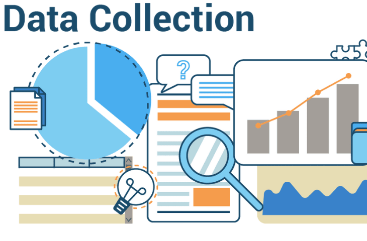
3. Collection of Data
After understanding what data is, the next step is collecting it properly. There are two main ways collecting primary data and secondary data.
a) Methods of Collecting Primary Data
Primary data is collected directly from the source. Here are some common methods:
| Method | Explanation |
| Personal Investigation | Researcher collects data personally from respondents. |
| Through Questionnaire | Data collected using a list of questions. |
| Indirect Oral Investigation | Data collected by asking questions through others. |
| Observation Method | Data gathered by observing people or situations. |
Also check out Most Repeated Quantitative Aptitude Questions for SSC CGL Tier 2
b) Sources of Secondary Data
Secondary data is already available and is collected from published or official sources.
| Source | Examples |
| Government Reports | Census data, Economic Surveys |
| Organizations | RBI, NSSO, CSO, NITI Aayog |
| Books and Journals | Statistical Yearbooks, Research Papers |
| Websites and Databases | Official portals like data.gov.in |
Check out Most Repeated Reasoning Questions for SSC CGL Tier 2
4. Classification of Data
Once data is collected, it needs to be organized or grouped properly. This process is called classification. It helps make large data easy to understand and compare.
Types of Classification
| Type of Classification | Basis | Example |
| Qualitative Classification | Based on qualities or attributes | Gender (Male/Female), Religion |
| Quantitative Classification | Based on numerical values | Income, Age, Height |
| Geographical Classification | Based on place or region | State-wise or city-wise population |
| Chronological Classification | Based on time | Year-wise or month-wise data |
Example Explanation:
If you have data of students’ marks and gender, you can classify it as:
- Qualitative: Male and Female
- Quantitative: Marks in Maths (0–20, 21–40, etc.)
Check out Most Repeated Computer Awareness Questions for SSC CGL Tier 2
5. Presentation of Data
After classification, the next step is presentation showing data in a simple and meaningful form. Presentation makes data easier to read and understand. There are three main ways to present data:
a) Textual Presentation
In this form, data is written in a paragraph.
It is useful when the data is small and easy to describe.
Example:
“The population of India increased from 121 crore in 2011 to 138 crore in 2021.”
b) Tabular Presentation
In this form, data is arranged in rows and columns.
It is the most common and easy-to-read method of presentation.
| Year | Population (in crore) |
| 2011 | 121 |
| 2021 | 138 |
Explanation:
This table helps compare population growth between two years quickly.
c) Diagrammatic and Graphical Presentation
Sometimes, visual representation of data gives a clearer picture. This includes bar graphs, pie charts, histograms, and frequency polygons.
| Type of Diagram | Purpose |
| Bar Diagram | Compare different categories. |
| Pie Chart | Show percentage distribution. |
| Histogram | Represent frequency distribution. |
| Frequency Polygon | Show data trends for continuous series. |
| Ogive (Cumulative Curve) | Used to find median or quartiles. |
6. Importance of Classification and Presentation
Understanding and showing data properly is important because:
- It makes large data easy to understand.
- It helps in comparison between groups.
- It shows trends and patterns clearly.
- It is useful for making conclusions and decisions.
7. Common Formulas Related to Data (For SSC CGL Tier 2)
| Concept | Formula |
| Class Width | Upper Limit − Lower Limit |
| Class Mark (Midpoint) | (Upper Limit + Lower Limit) ÷ 2 |
| Cumulative Frequency | Sum of all frequencies up to a class |
| Percentage | (Part ÷ Total) × 100 |
Example:
If a class has 10, 20, 30 marks and total students = 60,
then % of students scoring 20 marks = (20 ÷ 60) × 100 = 33.33%
8. Tips to Study this Topic for SSC CGL Tier 2
Below are the tips to study this topic for SSC CGL Tier 2:
- Understand definitions and differences clearly.
- Practice classification and presentation questions from PYQs.
- Revise diagrams like histogram and pie chart regularly.
- Attempt mock tests to strengthen conceptual clarity.
Key Takeaways
Below are the key takeaways:
- Data can be primary or secondary.
- It must be classified properly for easy understanding.
- Presentation can be textual, tabular, or graphical.
- This topic forms the base for other concepts like mean, median, and dispersion in SSC CGL Tier 2.
Check out SSC CGL Exam Pattern
Qualified SSC CGL Tier 1? Get ready for Tier 2 Exam, check out the below blogs:
FAQs on Collection, Classification, and Presentation of Data
Ans. Data means a collection of facts or figures used for analysis.
Ans. Primary data is collected for the first time, while secondary data is already collected by someone else.
Ans. Textual, tabular, and diagrammatic (graphical) presentation.
Ans. It makes large data sets easier to study and compare.
Ans. Histogram and frequency polygon are used for showing frequency data.
- Average Problems for SSC Exams, Practice Questions with Solutions
- SSC CGL Previous Year General Awareness Questions in Quiz Format
- Top 100 SSC CGL General Awareness Questions, Download PDF
- 1000 SSC CGL General Knowledge Questions, Attempt Now
- IBPS PO vs SSC CGL vs RBI Assistant: Complete Comparison
- SSC CGL vs RBI Assistant: Salary Job Profile Comparison 2026 Guide

I’m Mahima Khurana, a writer with a strong passion for creating meaningful, learner-focused content especially in the field of competitive exam preparation. From authoring books and developing thousands of practice questions to crafting articles and study material, I specialize in transforming complex exam-related topics into clear, engaging, and accessible content. I have first hand experience of 5+ months in SSC Exams. Writing, for me, is not just a skill but a way to support and guide aspirants through their preparation journey one well-written explanation at a time.